
Friday 2 December 2011
Tuesday 3 May 2011


Monday 18 April 2011

Lists for production of magazine
Actor List
Phil Wade
Mel Heague
Jack Cunningham
Will Davenport
Costume List
Phil - Tight black jeans, black patterend t-shirt and black converse.
Mel - Tight blue jeans, black and white stripy top, black biker jacket, black military boots.
Will - Tight jeans, rolling stones t-shirt and converse.
Jack - Black and white shirt, tight lack jeans and converse.
Venue List
84 Liverpool Road South, Maghull
Tuesday 8 March 2011
My Music Magazine Genre Choice.
For my music magazine i have decided to choose my genre of my magazine as a rock/ heavy metal theme. I chose this because it is one of my favourite genres of music and will be good to create a magazine about. Here are some of the artists that fall under this category.
 |
| The Blackout |
 |
| Korn |
 |
| Arctic Monkeys |
 |
| My Chemical Romance |
Photoshop Practise
Here is the image that I practiced on in Photoshop. I used the different tools to alter the image and gain a better idea about how the software works and how it may help me produce my music magazine.
 |
| Before. |
 |
| After. |
Friday 4 March 2011


Thursday 3 March 2011
My Music Magazine Basic Mock-Ups
These are my music magazine basic mock ups. I have made them very basic so your get a little feel for how my magazine will look. I will be adding to how my magazine will look when I develop new skills for creating my magazine front cover, contents page and double page spread.


This is a basic mock up of the front cover of my magazine.

This is a mock up of my contents page within my music magazine.

This is a mock up of the double page spread which will be in my music magazine.

Music Magazine Photographs
These are a selection of photographs that i took but i will NOT be using in my magazine. They give me an idea of what i need to do to improve my photographs and what i exactly want in my photographs.
 |
| I took this by accident, but still think it looks good. |
 |
| JACKS FACE! (far right) |
 |
| Dirty boys |
 |
| Jack sucking his lip in |
 |
| <3 |
Wednesday 2 March 2011
Music Magazine Questionnaire Results
To determine what genre of magazine is should create, i created a questionnaire for my classmates to answer.
The results are shown in a graph form so they are easy for you to see.


The results are shown in a graph form so they are easy for you to see.
Results for my initial question.

For the answer YES to the question 'Do you buy magazines?' the results were -
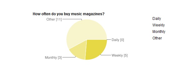


For the answer NO to the question ' Do you buy magazines the results were -


Tuesday 1 March 2011

Sunday 27 February 2011
Double Page Spread Analysis'
 |
| This is a 'My Chemical Romance' double page spread analysis. |
 |
| This is a 'NME' double page spread analysis. |
Friday 25 February 2011
Magazine contents page analysis'
 |
| This is a 'NME' contents page analysis. |
 |
| This is a 'Kerrang' contents page analysis. |
Front Cover Analysis'
 |
| Pete Doherty on the front cover of 'NME' |
 |
| Biffy Clyro on the front cover of 'KERRANG' |
Tuesday 22 February 2011

Newsletter Analysis


The Amborse Barlow newsletter would look much btter if it was set out more professionaly than it is set out currently, which is very chaotic.
Friday 11 February 2011
Cohen's Moral Panic
A moral panic is the intensity of feeling expressed in a population about an issue that appears to threaten the social order. Acording to Stanley Cohen, author of Folk Devils and Moral Panic and credited with coining the term, a moral panic occurs when a person of group of persons emerges to become defined as a threat to societal values and interests. Those who start the panic when they fear a threat to prevailing social or cultural values are known by researchers Those who start the panic when they fear a threat to prevailing social or cultural values are known by researchers as "moral entrepreneurs", while people who supposedly threaten the social order have been described as "folk devils."
Moral panics are in essence controversies that involve arguments and social tension and in which disagreement is difficult because the matter at its center is taboo.The media have long operated as agents of moral indignation, even when they are not self-consciously engaged in crusading or muckraking. Simply reporting the facts can be enough to generate concern, anxiety or panic.

Moral panics have several distinct features. According to Goode and Ben-Yehuda, moral panic consists of the following characteristics:
- Concern - There must be awareness that the behaviour of the group or category in question is likely to have a negative impact on society.
- Hostility - Hostility towards the group in question increases, and they become "folk devils". A clear division forms between "them" and "us".
- Consensus - Though concern does not have to be nationwide, there must be widespread acceptance that the group in question poses a very real threat to society. It is important at this stage that the "moral entrepreneurs" are vocal and the "folk devils" appear weak and disorganised.
- Disproportionality - The action taken is disproportionate to the actual threat posed by the accused group.
- Volatility - Moral panics are highly volatile and tend to disappear as quickly as they appeared due to a wane in public interest or news reports changing to another topic.
Friday 28 January 2011
Mock Up of College Magazine

This is a very basic mock up of a college magazine front cover.

Sunday 23 January 2011
Narcissistic Identification
These images are of Lady Gaga on the covers of
Narcissistic Identification demands identification with the object on the screen through the audiences fascination with him/her.

Narcissistic Identification demands identification with the object on the screen through the audiences fascination with him/her.

Feminism
As a perspective for looking at media texts, feminists would see most media output as being the product of a patriarchal or male dominated order, aimed at dis-em-powering women. Feminism was the response to society's assumptions that women should be subservient to men; until the emergence of feminism women were treated almost as objects, passive agents in a male world.
Laura Mulvey created a theory called the 'Male Gaze', these two magazine's Rolling Stone and Q, which show Lily Allen and Megan Fox in revealing or no clothes. This leads to assumption that this will make men buy the magazines, by just what is on the front cover of them 'objectification'.
NME completely went in the opposite direction to objectification, and shot the cover which shows that these magazines should be about the music that the people actually make, not about the gorgeous women involved. Also Megan Fox is not even a music artist, she is completely just a figure on the front of the magazine to make it sell more widely.
Laura Mulvey created a theory called the 'Male Gaze', these two magazine's Rolling Stone and Q, which show Lily Allen and Megan Fox in revealing or no clothes. This leads to assumption that this will make men buy the magazines, by just what is on the front cover of them 'objectification'.
 |
| Megan Fox on the front cover of Rolling Stone. |
 |
| Lily Allen on the front cover of Q. |
Mulvey argues that people look at things in two different ways,
- Voyeurism- turning the represental figure into an object so that it becomes increasingly beautiful.
- Fetishism- Cult of the female movie star, celebrated for her looks but considered an object and often treated as one.
 |
| Beth Ditto on the front cover of NME. |
Subscribe to:
Posts (Atom)